OEE dashboards: Your command center for productivity
Learn how OEE dashboards work, from ISO 22400 math and the six big losses to a step-by-step OEE rollout guide to boost your factory's efficiency and capacity.


You can't fix what you can't see. That's the problem most manufacturers face when trying to understand production efficiency. Your lines might look busy with operators and technicians working hard, but output still falls short.
An OEE dashboard transforms that invisible productivity gap into clear, actionable manufacturing intelligence, showing you exactly where time, speed, and quality slip away so you can do something about it.
What is an OEE dashboard?
An OEE (Overall Equipment Effectiveness) dashboard is a visual command center that displays real-time and historical data about your manufacturing productivity.
At its core, an OEE dashboard tracks the internationally standardized ISO 22400-2 OEE metric:
OEE = Availability × Performance × Quality.
But a good dashboard does more than show you a single percentage. It breaks down that number into its three components:
Availability: What percentage of scheduled production time are your machines actually running?
Availability rate =
(Actual Operating Time / Planned Production Time) x 100Performance: How fast are you producing compared to ideal speed?
Performance efficiency =
((Processed amount x Ideal cycle time) / Operation time) x 100Quality: What percentage of your output is good the first time?
Quality rate =
((Processed amount – Defect amount) / Processed amount) x 100
This three-factor breakdown is part of what makes OEE dashboards powerful. For example, instead of “just” knowing you're at 67% efficiency, you can see that you're losing 15% to unplanned stops, 12% to running below design speed, and 6% to quality issues. Each loss points to different root causes and solutions.
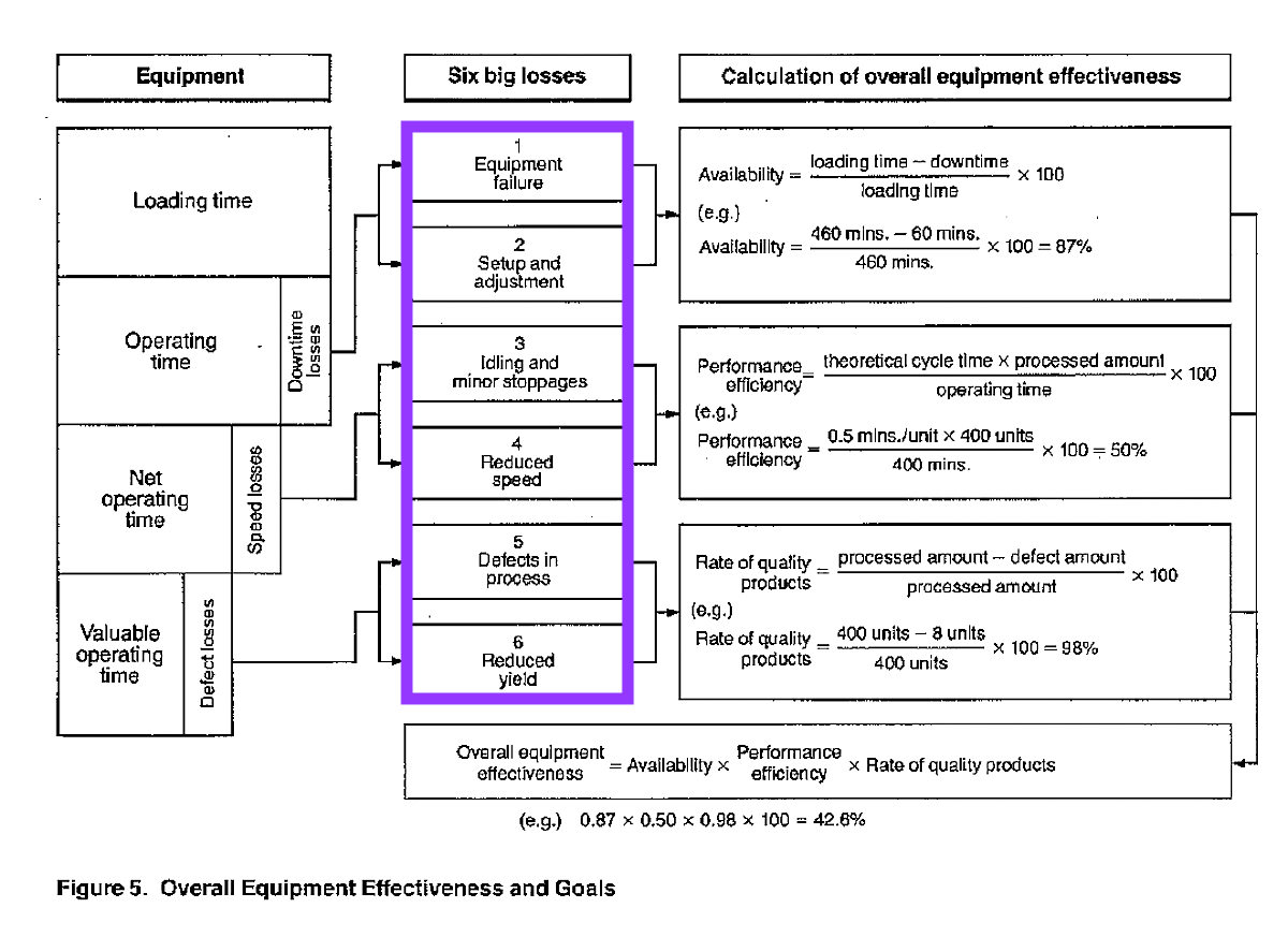
The best dashboards also map these losses to more granular categorizations. The Six Big Losses framework from Total Productive Maintenance (TPM) is common: equipment failures, setup and changeovers, small stops and idling, reduced speed, startup rejects, and production defects. This categorization turns your dashboard into a diagnostic tool, not just a scoreboard.
You can learn more about Nakajima’s TPM approach to OEE in this short lesson: The Nakajima OEE approach with examples.
Not all OEE dashboards are made the same. OEE dashboards can range from manually updated Excel sheets to cloud-based, real-time OEE dashboards.
Why real-time OEE dashboards matter
The obvious benefit of live OEE dashboards that cover all of your lines and sites is visibility. But the real value goes deeper into how that visibility changes behavior and decision-making.
You shift from reactive to proactive: When you discover efficiency problems at the end of a shift (or worse, at the end of a month) you can't recover that lost production. A real-time OEE dashboard that updates every minute lets you intervene while there's still time to hit your targets. Is your production line trending toward 55% OEE by the end of the shift? You can troubleshoot that chronic stop pattern now, not tomorrow.
You create a common language: Every manufacturer has dealt with the problem of different lines, shifts, and sites measuring productivity differently, making comparison and learning impossible. A good, multi-site OEE dashboard standardizes the calculation across your operation. When Line 2 on second shift hits 88% OEE while Line 1 on first shift manages 71%, you can have a productive conversation about what Line 2 does differently, because you're measuring the same things the same way.
You reveal hidden capacity: Most manufacturers facing capacity constraints think about adding lines or shifts. But it’s expensive to add new equipment, and staffing is tricky, and if you're running at 65% OEE, you're leaving 35% of your existing capacity on the table. A dashboard that categorizes losses might show you that 8% of your capacity disappears in two-minute micro-stops that never make it into anyone's log.
You make improvement measurable: You've probably invested in kaizen events, new tooling, operator training, or preventive maintenance programs. Did they work? Without baseline OEE data and ongoing tracking, you're guessing. A dashboard helps to create the before-and-after evidence that turns improvement from hunch-based to fact-based.
How OEE dashboards work
The technical architecture behind an OEE dashboard involves several layers:
Data collection happens at the machine level. Sensors detect when equipment is running or stopped. Counters track production output. Quality systems record defects and scrap. Modern platforms like Factbird's OEE software can capture data via plug-and-play edge devices that can be set up in minutes as well as through direct integration to PLCs, MES, or SCADA systems.
Data processing computes OEE in almost real time. This isn't as simple as it sounds; you need to handle shift and batch information, distinguish planned from unplanned downtime, categorize stop reasons, and accumulate counts accurately. The system must also address edge cases: What happens during changeovers? How do you treat rework? (Best practice: count initial defects to capture true first-pass quality, even if parts are later reworked successfully.) Solutions like Factbird’s Operator View make contextualization of your production data much easier.
Visualization presents the data at different detail levels for different users. Operators on the shop floor need large, high-contrast displays showing current shift OEE and active problems. Plant managers need multi-line comparisons and shift-to-shift trends. Executives need multi-site scorecards. A well-designed dashboard serves all three audiences without overwhelming any of them.
Following ISA-101 HMI standards, effective manufacturing dashboards use visual hierarchy (most critical data largest and most prominent), consistent color coding (green for on-target, yellow for caution, and red for problems), and progressive disclosure (summary at a glance, details on demand).
Watch a demo of Factbird’s OEE dashboard
Would you like to see an OEE dashboard in action? Watch this short tutorial of Factbird’s OEE analytics dashboard to see how a best-in-class system works.
Industry-specific considerations
OEE dashboards look similar across industries, but the details matter:
Food and beverage manufacturers face frequent changeovers between products and package sizes, plus rigorous cleaning requirements between runs. Your dashboard needs to track changeover duration separately from unplanned downtime and capture cleaning time as distinct from equipment failure.
Pharmaceutical operations require audit trails and data integrity that satisfy 21 CFR Part 11 for electronic records. Your dashboard must distinguish planned activities (sampling, testing, validation) from unplanned downtime, maintain complete batch genealogy, and provide tamper-evident records with user authentication.
Packaging lines running at 300+ units per minute accumulate losses differently than slower operations. A three-second micro-stop happens 100 times per shift? That's five minutes of lost production that would never appear in a downtime log but clearly shows up in your Performance component. Your dashboard needs to capture these minor stops and pinpoint which station on your integrated line is the culprit. You can watch the success story about Broxburn Bottlers, a leading UK bottling services provider, to see the impact that measuring micro-stops can have.
FMCG/CPG manufacturers juggling dozens or hundreds of SKUs benefit from changeover matrices showing OEE by product transition (switching from Product A to Product B costs you more than B to C) and SKU-level performance analysis that reveals which products run efficiently and which consistently cause problems.
[CTA]
Getting started: implementation without the pain
Traditional manufacturing IT projects take months and cost hundreds of thousands of dollars. Modern approaches like Factbird's OEE software reduce that timeline dramatically through efficient data capture and user-friendly software. Here’s how implementation of OEE dashboards could look at your business:
Start with a pilot: Select 1-2 lines representing different challenges. Install monitoring equipment, validate data accuracy, and define your reason codes. This foundation phase typically takes 2-4 weeks.
Establish your baseline: Run for 4-6 weeks without making changes. You need to understand your current state before you can measure improvement. This baseline also reveals data quality issues you'll need to address.
Analyze and prioritize: Once you have reliable data, conduct root cause analysis on your top 3-5 losses. Don't try to fix everything at once. Focus on losses that are frequent, long-duration, or have known solutions.
Improve and measure: Implement targeted improvements and track before-and-after OEE. This creates the evidence base for broader deployment and builds organizational confidence in the approach.
Critical success factors include leadership commitment (regular review of OEE data at all levels), operator engagement (involve frontline staff in problem-solving, never use dashboards for blame), and data quality (invest in accurate reason code collection, not perfect upfront).
Watch our full OEE implementation lessons for an efficient framework for rolling out OEE: Five-step OEE implementation strategy.
Beyond the basics: where OEE dashboards are heading
The next generation of OEE dashboards moves from monitoring to guidance. Predictive analytics forecast end-of-shift performance while there's still time to intervene. Pattern recognition correlates seemingly unrelated events ("Line 3 always has more quality issues on the second shift when running Product X after Product Y"). Prescriptive recommendations suggest optimal production sequences to minimize changeover losses.
We're also seeing convergence with sustainability metrics. Energy per unit produced, water consumption, and carbon intensity are increasingly displayed alongside OEE, creating a holistic view of manufacturing excellence that balances productivity with resource efficiency.
One tool that you can use today to get instant, deeper insights into your production is Factbird’s AI Assistant, an exciting chat tool for exploring your production data, such as batch comparisons, scrap trends, and your golden batch.
The path to world-class OEE (typically cited as 85% or higher, though this varies by industry) starts with visibility. You can't optimize what remains invisible.
An OEE dashboard makes the invisible visible, transforming lost time, lost speed, and lost quality from mysteries into measurable and solvable challenges. Book a demo today to find out more about our OEE dashboards and how they can impact your organization.
.png)